Energy Innovation and Carbon Dividend Act Dataset
Would you like to know how much carbon cash back a family of four is projected to receive in 2025 (or another future year)? Or the total U.S. greenhouse gas emissions in 2030 if the Energy Innovation Act policy is adopted? Or how the Act performs compared to the IPCC recommendations for emissions reduction? Well, now you don’t have to guess, or ask around, or try to sweat the numbers out yourself – the Energy Innovation & Carbon Dividend Act Dataset provides all of these answers and more!
Background
The Energy Innovation and Carbon Dividend Act of 2023 (H.R.5744) is the result of CCL’s many long years of working with Congress to enact a carbon fee and dividend (CF&D) policy. Along the way, multiple studies were conducted to forecast environmental and economic outcomes of the policy.
However, the Energy Innovation and Carbon Dividend Act of 2023 (H.R.5574) has unique features that affect predicted outcomes and data. It also differs from the version introduced in the 117th Congress (H.R.2307) in a few ways:
· Revised yearly targets for emissions reductions, which are 8% below 2005 emissions each year until 2030 and 2.5% below 2005 emissions for each year thereafter. These targets are achievable and necessary to hit the reductions we know are needed by 2030 and 2050.
· 2005 is the new emissions baseline year, given that it is now the most widely used and was also selected as the basis year for the U.S. commitment to cut 50-52% under the Paris Agreement (U.S. NDC).
CCL volunteers need CCL-approved data that matches, as accurately as possible, what this legislation will produce. This includes an estimate of how the Energy Innovation Act will enhance emission reductions from the Inflation Reduction Act.
That’s why we’ve produced this dataset in the form of an Excel spreadsheet (see dataset below) that makes all these results available to CCL volunteers. You can download either a Basic or Advanced version, and we will update it as necessary when new information becomes available.
|
Note that Version R12 has been replaced by Version R20C:
Data tables now include emissions reference year of 2005 to facilitate comparison with data and targets discussed elsewhere. |
What You Can Find
There are four basic types of Energy Innovation Act data that can be obtained from the dataset:
- The carbon fee schedule from 2025 to 2050
- The change in emissions year by year
- The amount of carbon fee revenue year by year, before and after administrative costs, which tells us the total amount of money projected to be available for carbon dividends
- The projected size of a monthly adult dividend or dividend for a family of four in any given year
A number of charts are provided in the dataset tab entitled CHARTS, but there is also a ScratchPad tab where you can make your own tables and charts, either by copying and modifying pre-built charts (Basic or Advanced) or building your own from the data tables (Advanced only).
The Advanced version of the Dataset is functionally similar to the Basic version except that it unhides all the tabs that feed data to the INPUT user interface and the CHARTS tab:
Key Highlights
The following four charts provide a glimpse into what information and visual data is available in the CHARTS tab.

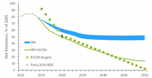
Figure 1: Emission projections for the IRA only, the IRA plus H.R.5744, and H.R.5744 annual targets
The data in this chart show the estimated reduction in net U.S. CO2e emissions (total emissions minus carbon sinks) from 2020 to 2040. The projections do not go past 2040 because of the high uncertainty of modeling that far out. The tan dotted line from 2020 to 2025 represents the past emissions and projected emissions to 2025. The blue wedge represents emissions reductions estimated for the IRA along with other current policies. The green wedge represents additional emissions cuts predicted for H.R5744 by our combined modeling from Energy Innovation and RFF. Importantly, this forecasting does not yet account for any further policy action in the Healthy Forests and Building Efficiency and Electrification areas.
In the data spreadsheet, users could copy and paste this chart into the ScratchPad page and then customize the format to suit their preferences for a poster, presentation, etc.

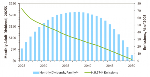
Figure 2: Monthly Dividends for a family of four, along with projected emissions
The data in this chart shows the expected monthly carbon dividends for a family of four, based on the emissions modeling adopted for this dataset up to 2040. This data series is based on the assumption that the carbon fee continues to increase annually by $10 per metric ton of CO2e. The dollar amounts are expressed in 2025 dollars, including an inflation adjustment up to that year, but not for subsequent years. So, for example, if inflation from 2025 to 2030 totaled 20%, the monthly dividends in 2030 for a family of four (expressed in 2025 dollars as $164) would actually be $197 if expressed in 2030 dollars. The accompanying emissions curve helps show why dividends peak and then start to decline as emissions continue to decrease.

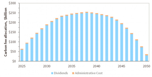
Figure 3: Carbon fee cash flow as allocated between household carbon dividends and program administrative cost
This chart shows the total amount of carbon dividend revenue expected for each year, based on the emissions reductions stipulated in the legislation, and how the revenue will be allocated between carbon dividends sent to households (in light blue) and administrative cost of the program (in light orange). It shows that the cost to collect fees, administer the fund, and send cash back to households is a small percentage of program revenue, and how those costs change very little while the total revenue increases.

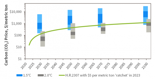
Figure 4: Emissions from the IRA H.R.5744 compared to the IPCC’s window for staying between 1.5 and 2.0°C of global temperature growth.
This chart shows how the passage of H.R.5744 on top of the IRA will affect U.S. emissions compared to the IPCC forecasts to stay within 1.5°C and 2°C limits of global temperature rise by 2100. Note that the IPCC number forecasts are for global emissions while the modeled wedge is only for U.S. emissions, but this still helps visualize how our proposed policy fits within the global responsibility for U.S. climate policy. As mentioned earlier, not Healthy Forests or Building Efficiency and Electrification advances are accounted for in these projections.
Examples of How To Use the Dataset
Here are some examples of things you can do with the data. These examples require some skill with manipulating Excel data and charts. If you need help, it’s likely that someone else in your chapter can help out.
- What if you are asked how much in carbon dividends a family with one adult and three children will receive in 2022, 2025, and 2030? You can grab data from the chart for Carbon Dividends from the INPUT tab, take the numbers for an adult and multiply them by 2.5 (1 for the adult and 0.5 for each of the three children).
- What if someone asks how much in total carbon fee revenue the program will collect in the first 10 years? You can collect the numbers for each year from 2025 to 2035 and add them all up.
- What if you need a chart showing how the adult carbon dividend will change over the entire scope of the plan from 2022 to 2050? There is already a chart for that in the CHARTS tab.
- How about a chart showing emissions under the bill compared to what the IPCC says we need to do by 2030? There is already a that contain those data up to 2040, which you can copy and paste into the ScratchPad and then shorten each of the series ranges by 10 years. We can show you how to do that.
Dataset Overview
| Glossary | Definition of terms |
|---|---|
| Tables | Data tables showing the Energy Innovation & Carbon Dividend Act rate schedule, emissions results, carbon fund cash flow, and dividend payments. |
| Model | Emissions forecast from selected third-party (RFF and EPS) models, adapted to a 2025 starting year and estimated 2025 emissions. |
| Charts | A collection of charts and graphs based on the data in this document, also following the CCL Style Guide. |
| Scratch Pad | A blank page where you can make your own charts, tables, or notes drawing from the data in the other tabs. For example, you can copy and paste charts from the Charts tab and then alter them to suit your needs. |